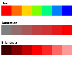
HUE, SATURATION AND BRIGHTNESS
There are three main characteristics that can define color: Hue, Saturation and Brightness. The hue is the color itself, as you can see the variations in the image below. The saturation refers to the amount of color that distances it from the gray (a grayscale image, for example, is fully unsaturated). The brightness refers to the amount of black or white in the color. This is how the HSB system works, based on these values to create any color.
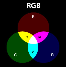
ADDITIVE AND SUBTRACTIVE COLOR
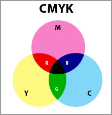
We can work with these two color models, each one, for its own purposes. The additive model is based on mixing the light, while the subtractive model is based on mixing the pigments. In a simple way, we work with the additive model (RGB) when preparing contents to be displayed on tv, internet, mobile or any light source. When working for printing, we work with the subtractive model (CMYK).
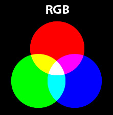
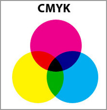
Notice something interesting: the mixing of RGB creates CMY colors, while the mixing of CMY creates RGB colors. And again, the mixing of light colors creates white and the mixing of pigment colors create black.
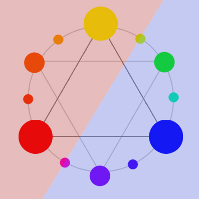
COLOR WHEEL
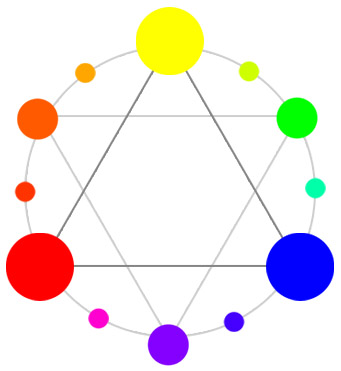
The color wheel is the circular organization of colors according to hue. This representation is based on the primary colors (according to the standard color wheel: RYB) and shows the mixing between them.
The image shows a simple color wheel that will guide us when talking about color harmonies. Attention to the primary, secondary and tertiary colors in different sizes.
COLOR HARMONIES
Let’s see some of the combinations that we call harmonies. They tend to compose a good combination, but, of course, any project has its particularities.
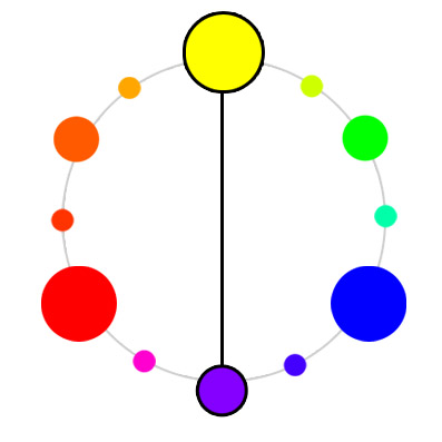
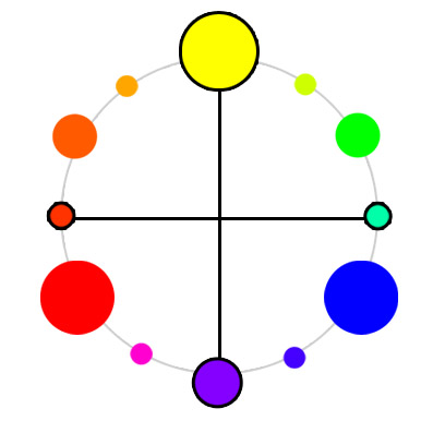
Complementary Colors
The complementary color makes a high contrast layout, use carefully.
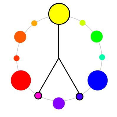
Double Complementary
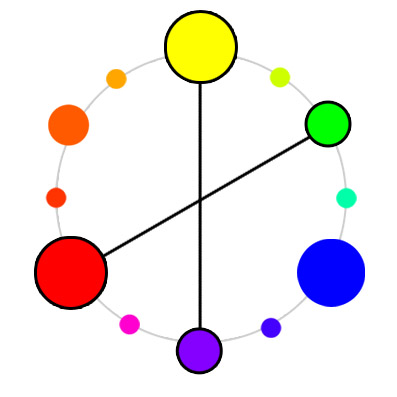
Double Complementary
Analogous
The analogous harmony has a low contrast and makes a softer pallete.
Analogous with complementary

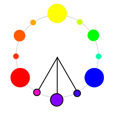
Tetrad
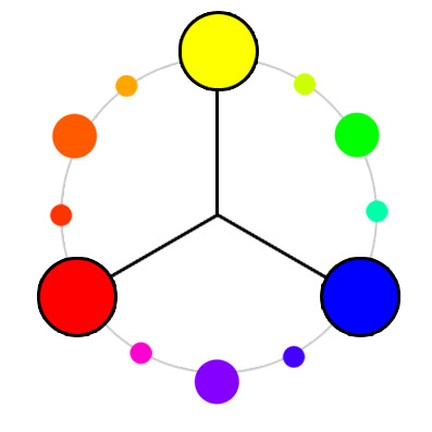
Triad
WARM AND COOL COLORS
We can separate colors in warm and cool. The warm colors are the ones close to orange, red and yellow. The cool ones are next to blue, violet and green. The image shows the “line” between them. Adding warm colors make the layout more cozy, happy and vibrant, while using cool colors make it more cold, serious and formal.
http://colorschemedesigner.com/
Color Harmonies
Basic techniques for combining colors
Below are shown the basic color chords based on the color wheel.
|
| |
 |
Complementary The high contrast of complementary colors creates a vibrant look especially when used at full saturation. This color scheme must be managed well so it is not jarring. Complementary colors are tricky to use in large doses, but work well when you want something to stand out. Complementary colors are really bad for text. |
|
| |
 |
Analogous Analogous color schemes are often found in nature and are harmonious and pleasing to the eye. Make sure you have enough contrast when choosing an analogous color scheme. Choose one color to dominate, a second to support. The third color is used (along with black, white or gray) as an accent.
|
|
| |
 |
Triad Triadic color harmonies tend to be quite vibrant, even if you use pale or unsaturated versions of your hues. To use a triadic harmony successfully, the colors should be carefully balanced - let one color dominate and use the two others for accent. |
|
| |
 |
Split-Complementary This color scheme has the same strong visual contrast as the complementary color scheme, but has less tension. The split-complimentary color scheme is often a good choice for beginners, because it is difficult to mess up.
|
|
| |
 |
Rectangle (tetradic) This rich color scheme offers plenty of possibilities for variation. The tetradic color scheme works best if you let one color be dominant. You should also pay attention to the balance between warm and cool colors in your design.
|
|
| |
 |
Square The square color scheme works best if you let one color be dominant. You should also pay attention to the balance between warm and cool colors in your design.
|


Posted in Inspi./Research. Topㅣ